Checkpoint Brand Guidelines
Checkpoint is a points ecosystem that connects points programs (45+ and counting), enabling users, builders, and projects to easily check, track, display, develop, tokenize, and trade points. The protocol relies on code and integrations to enable a seamless offchain and onchain points experience for all users.Logo
Checkpoint logo and emblem.
Visual
Typography and visual identity.
Voice
Voice and messaging.
Logo Versions
The Checkpoint logo is the primary identification symbol. Use it wherever possible and relevant. The Checkpoint emblem is used when there is not enough room for proper placement. The emblem is also used for creative content, such as memes..png)
.png)
.png)
.png)
.svg)
.png)
.png)
.svg)
.png)
.png)
.svg)
.png)
.svg)
.png)
Logo Color Palette
Checkpoint’s logo and emblem are primarily used on a dark background. Whenever possible, present it that way.On dark backgrounds
Use the light mark color.
HEX
#d5d5d5RGB: 213, 213, 213
HSB: 207°, 0%, 82%
CMYK: 17%, 13%, 13%, 0%
On light backgrounds
Use the dark mark color.
HEX
#2d2d2dRGB: 45, 45, 45
HSB: 207°, 0%, 17%
CMYK: 70%, 64%, 63%, 64%
About Logo Usage
Unless for creative purposes (memes, accentuation for production, etc.), try to follow the logo versions and designated color palette. Aim to not do the following:Change Color
.png)
.png)
Rotate Logo
.png)
.png)
Disproportional Change
.png)
.png)
Cropping
.png)
.png)
Skewing
.png)
.png)
Opacity
.png)
.png)
White Space
.png)
.png)
Modifications
.png)
.png)
Font Change
.png)
.png)
Design Sins
.png)
.png)
Typography and Visual Identity
Typography is an important part of Checkpoint’s brand and visual identity. The emphasis on ASCII as visual representation of Checkpoint is rooted in the ambition of creating the fastest, most lightweight and intricate application, that is simultaneously very difficult for LLM to mimic, interpret, and reproduce.VT323
VT323 is the primary font for Checkpoint. Letter spacing changes based on hierarchy: headings are more compact (-5 to -10%) while paragraphs retain their original spacing. We use no variations and no font weight.Inter
We use Inter to increase legibility for data and long descriptions. Inter is interchangeable with VT323 for paragraphs and readable text. All variations of Inter are acceptable. As a general rule, we use heavier font weights for headlines and lighter forms for information. You can also use typography colors to accentuate elements instead of changing font weights.ASCII Headers
For ASCII headers, we combine fonts where the fills are converted to characters. These should always be retro fonts like VT323, Arcade Quest, or Bitmap Pixel.ASCII Fill
The fills of our ASCII content vary. We generally use VT323, but any monospaced font works if the character widths are the same. For font-based ASCII art, a general character fill is enough.Monospaced fonts have characters occupying the same horizontal space.
Static Content
For other content that has pixels, it varies. All images rendered in pixels contain a white and black value, that most ASCII conversion software converts to the characters to fill. For static images, there are three distinct techniques used when producing content, and they all revolve around the colour values of the background and not the subject.Guideline, not a rule
These examples are a baseline for consistency. When in doubt, creative direction and campaign context take precedence.
Neutral Backgrounds
These are images with significant whitespace. In these cases, we accentuate the lighter parts of the subject with ASCII characters. We use darker ASCII colors for the borders, but we avoid using them for shadow accentuation. You can introduce ASCII values outside of the subject wherever it makes the content more interesting or aligns with a campaign. The remainder of the whitespace is used for visual font accentuations or other elements that make the content more interesting or more aligned with a campaign.
Full Backgrounds
These images have high variation in pixel values and limited whitespace. When this is the case, the main subject is fully converted to a very light#FFFFFF or very dark #000000 value. To do so, the subject is cut out of the image, and the dark and white values are rearranged with FX (Curves, Levels and/or Exposure) to attain the desired effect. Then for the cutout an ASCII effect is placed. The important part is that the subject itself is the whitespace, guiding the attention towards it.
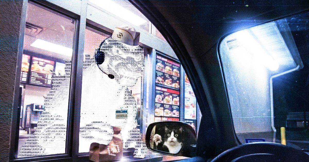
Colorful Backgrounds
When using images with high saturation colors that contrast our monochromatic theme, we accentuate the subjects with ASCII overlays. We do not need to cut these subjects out. Instead, we overlay the characters by tweaking opacity or adjusting the blending modes.
Aspect Ratio
For social media content preferred aspect ratios include:- 1.91:1 (1200x630)
- 1:1 (1080x1080)
- 16:9 (1920x1080)
- 9:16 (1080x1920)
- 19.5:9 (1284x2778)
Colors
Checkpoint uses a monochromatic design theme for user-facing applications.| Token | Dark Theme | Light Theme |
|---|---|---|
--background | #1a1a1a | #ffffff |
--background-b | #272727 | #dddddd |
--input-bg | #111111 | #dddddd |
--input-hover-bg | #272727 | #cccccc |
--font | #d5d5d5 | #2d2d2d |
--sub-font | #777777 | #777777 |
--highlight-font | #fdfdfd | #0b0b0b |
Brand Voice
Whenever possible and relevant, avoid emojis and AI gibberish (filler adjectives) and indentations. Instead, use ASCII emojis or unicode.- Tone: Informal, direct, and humorous
- Style: Sincere, conversational, and human
Messaging Pillars
- Owned value, not rented points
Merit carries value; points are inherently valuable, users provide value to initiatives which in turn reward that value with points. Checkpoint turns them into tangible value. - Check and track every point. Trade, build, and own the value
Points are not just balances; they are a running log of everything users have contributed. Checkpoint keeps the receipts so people can replay their history, move it between ecosystems, and cash in on the work they already did. - Lightweight stack, programmable points
We keep the infrastructure razor-thin so points can move anywhere. We treat every balance as a programmable primitive, not just a static number on a dashboard, so the ecosystem can build with them.
About Checkpoint
Learn more about Checkpoints focus and goals.
One Liner
Check, track, trade and tokenize points across any project and chain.
ELI5 (onchainers)
Check and track every point you own in one spot. Back your points on Checkpoint to tokenize and trade them. Move your value, or acquire contributions and the value they carry.ELI5 (nonchainers)
Imagine if you could trade any points you have. Missing a point to book a flight? Have unused points you want to sell for cash? Checkpoint turns your points into internet money so you can actually buy or spend them.Some benefits in a nutshell
- The only points dashboard there is and you need: view your points and contribution across any integrated project or chain.
- Trade points before TGE: turn points into liquid assets and trade them on the exchange.
- Trustless points liquidity you can verify: every trade stays secured by onchain escrow so you get the tokens or the collateral.
- Acquire contributions from others: buy the proof of work from others to skip the grind and get a stake in the value.
- Points that act like assets: move your data out of isolated silos and turn it into programmable value.
Discord
Questions? Get in touch with the community.
X (Twitter)
Check current communication and branding angles.